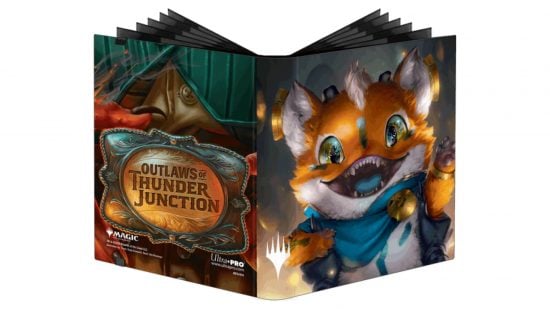
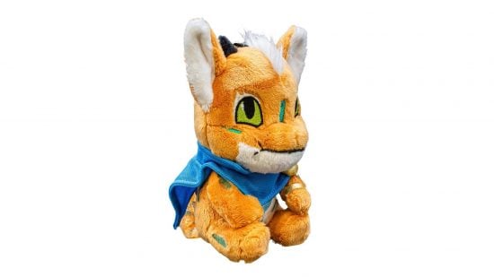
MTG Thunder Junction’s mascot character Loot has a plush gamer pouch from Ultra Pro now, and it hasn’t made my distaste for the character any less pronounced.
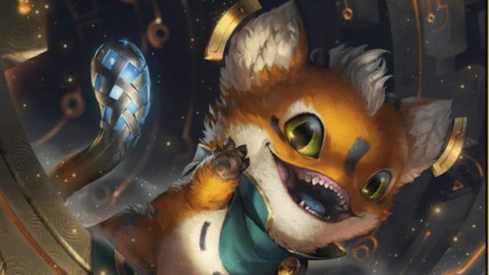
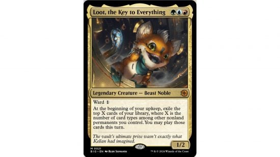
In case you’re out of the loop, MTG Outlaws of Thunder Junction ends with our heroes opening a vault and finding a little guy, Magic’s new marketable mascot, Loot. With gigantic eyes, a podgy shape and orange and white coloration, he gives off major Porg vibes. But whereas Porgs are adorable little puffin fellas, Loot is sinister and hideous.
It doesn’t help that he looks like an off-brand Pokémon or League of Legends character, and seems to be trying just a bit too hard to be cute, but there are also numerous elements of the design I do not enjoy.
I dislike the mini mohawk tuft of hair. I can’t get behind the random squiggly lines that dot his body without rhyme or reason – this sucks when Pokémon does it too. And the colors are just really ugly. But the main problem is, of course, the mouth.
I don’t mind the worryingly sharp teeth, or absence of nose. But it’s the way those teeth sit inside a smiling mouth that is far too large for them that gives me the heebie jeebies. It makes Loot look toothless and toothy at the same time, giving him – to my mind – a ghoulish grin.
And… I’m not quite sure if it’s the mouth doing this, or something else, but he looks too knowing, somehow. One thing that makes a marketable mascot work is an element of helplessness. They’re adorable, and you want to protect them. But, at least to me, Loot’s art conveys an unexpected intelligence, a smug expression that just makes the whole thing seem wrong.
Since Ultra Pro’s new gamer pouch toy has its mouth closed in a pencil thin line, you might think my problems would evaporate, and it solves some of them, but this bit of merch is ugly in a whole new way.
For a $20 product, it looks kind of cheap, utterly generic, and still completely fails to be endearing. Crucially, it’s miles off from the character it is supposed to depict. The head shape, for instance, is entirely different, looking more like a dragon than the little gremlin Loot seems to be. And the tail is completely different.
Judging by the social media reaction, I’m not alone in my distaste for this new character, but there are plenty who feel the opposite. The subject is surprisingly divisive in fact. Is Loot creepy or cute? It seems this could be Magic’s modern-day equivalent of the blue/gold dress: destined to tear apart playgroups, commander nights, and families, as opposing views clash. My partner thinks he’s cute. Uh oh.
Honestly, couldn’t Wizards of the Coast have waited one more MTG set to launch an adorable mascot? MTG Bloomburrow is right around the corner, guys! Why couldn’t Jace and Vraska’s son be a little otter dude?


